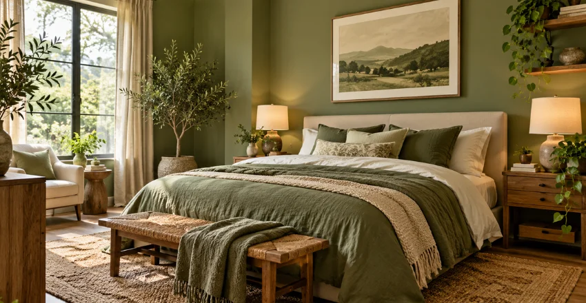
Green can make a bedroom feel calm, warm, fresh, or dramatic, depending on the shade. The strongest green bedroom ideas start with light, room size, and existing furniture. Once those basics are in place, color becomes much easier to control.
A successful green bedroom starts with the room’s light, then matches the shade to that light. Sage and olive suit softer schemes, while forest green adds depth in brighter spaces. Finish with warm neutrals, natural wood, layered lighting, and a limited accent palette for a balanced result.
| Design choice | Works well for | Pair with | Watch for |
|---|---|---|---|
| Sage green | Small or relaxed bedrooms | Cream, oak, blush | Cool undertones in weak daylight |
| Olive green | Warm, earthy schemes | Walnut, terracotta, brass | Too many brown accents |
| Forest green | Larger or brighter rooms | Oatmeal, pink, dark wood | Heavy walls in cramped spaces |
| Green feature wall | Renters or cautious decorators | Neutral bedding, simple art | Too many competing patterns |
| Green furniture | Low-commitment updates | Warm white walls | Mismatched green tones |
TL;DR: Start with a green that suits your daylight, then keep the supporting palette simple. Use warm neutrals, natural wood, and soft textiles to control the mood. Add darker green on furniture, panelling, or one wall if the whole room feels too strong.
Why green works so well in UK bedrooms
Green covers a wide range, from pale grey-green to deep bottle shades. That range makes it useful in compact flats and larger period homes. It also sits comfortably beside materials already common in British bedrooms. Current UK inspiration pages show this same flexibility. House & Garden features pale, fresh, and dark schemes in its 2026 bedroom gallery.
Dulux and IKEA also pair green with neutrals and natural materials. The key is restraint, not using one shade everywhere. A calm scheme usually needs contrast between walls, bedding, furniture, and flooring. That contrast helps the color feel intentional instead of flat.
How to choose the right shade before decorating
Start by checking your room during morning, midday, and evening. Paint can change as daylight weakens or artificial light takes over. Keep a tester visible for several days before deciding. North-facing bedrooms often receive cooler, blue-toned light. That can make certain greens feel colder or greyer than expected. Warmer olive, moss, or yellow-based tones may feel more comfortable there.
South-facing rooms give you more freedom because sunlight is usually stronger and warmer. Cooler sage, blue-green, and deeper shades can work without feeling dull. Always test the exact paint before buying a full tin. If you prefer a neutral backdrop, warm stone shades can soften a green scheme.
Wrytra’s Skimming Stone guide explains how warm greys and taupes work beside green accents. That approach suits bedrooms where bedding should carry most of the color.
15 green bedroom ideas that suit real UK homes
1. Start with sage walls and warm white bedding.
Sage is easy to live with because it behaves like a softened neutral. Pair it with warm white bedding and pale timber furniture. This combination keeps the room light without looking plain.
2. Use olive green for a warmer, earthier scheme.
Olive contains more warmth than many grey-green paints. It looks especially good beside walnut, oak, rattan, and muted terracotta. Keep the ceiling lighter so the room still feels open.
3. Try forest green behind the bed.
A dark feature wall can frame the bed without covering every surface. Forest green works well with upholstered headboards and pale linen. Use warm bedside lamps to soften the wall.
4. Paint fitted wardrobes instead of every wall
Painted wardrobes give you a strong color block with less commitment. This idea suits white, cream, or stone walls especially well. Choose a finish designed for furniture and regular handling.
If you are repainting a wardrobe or bedside cabinet, preparation matters. Wrytra’s furniture paint guide covers chalk-style, satin, eggshell, and harder-wearing options. Match the finish to the surface and how you’ll use it.
5. Pair green with blush or dusty pink.
Pink adds warmth without fighting the green. Muted blush works better than bright candy tones in restful rooms. Repeat the pink once or twice through cushions, lampshades, or artwork.
6. Combine sage with beige and reddish brown.
This palette feels soft without becoming colorless. IKEA UK uses sage with light beige, pink, and reddish-brown accents in a green bedroom scheme. Natural wood and woven textures strengthen that relaxed effect.
7. Use green panelling for subtle depth.
Paneling adds shadow and structure before color enters the scheme. A mid-green paint can make those lines more visible without looking busy. Keep nearby bedding plain so the wall remains the main feature.
8. Paint the ceiling for a cocooning look.
A colored ceiling can make a larger room feel more connected. Use the wall color again, or choose a slightly softer version. Avoid the darkest option if the ceiling already feels low.
9. Add green through bedding in a rental.
You do not need paint to change the room. A duvet cover, throw, and two cushions can create a clear palette. Keep permanent surfaces neutral so everything can move with you later.
10. Bring in natural wood and woven texture.
Green becomes softer beside oak, ash, bamboo, or rattan. Those materials break up large painted areas and add warmth. Linen curtains and wool rugs can create the same balancing effect.
11. Use mirrors to help a small room feel brighter
A mirror can reflect available daylight and reduce visual heaviness. Place it where it catches light without creating glare from the bed. Slim furniture can also protect valuable floor space.
Some planning ideas transfer well from other compact rooms. Wrytra’s small living room guide covers vertical storage, reflective surfaces, and slim furniture. Those principles can help a small bedroom feel less crowded.
12. Keep the palette to three main colors.
Too many accents can make a restful room feel busy. Use green as the lead, one neutral, and one warmer accent. Repeat those colors across textiles and small decorative pieces.
13. Layer several greens through texture.
Using one identical green everywhere can look flat. Mix sage, moss, or olive through velvet, linen, painted wood, and ceramics. Keep the undertones related so the room still feels connected. These green bedroom ideas work best when texture does some of the design work. That reduces the need for extra pattern or decorative clutter. A limited palette can still feel rich when materials change.
14. Use hidden storage to protect the calm look.
Visible clutter can weaken even a well-planned color scheme. Choose under-bed drawers, baskets, fitted cupboards, or a storage bench. Keep frequently used items easy to reach. For a child’s room, storage needs to be simpler and safer. Wrytra’s toy storage guide covers under-bed storage, bins, shelving, and wall-mounted options. Adapt those ideas to the child’s age and available space.
15. Finish with layered warm lighting.
One central ceiling light rarely creates a relaxed bedroom atmosphere. Combine ambient light with bedside lamps and a focused reading light. Warm lamps can make green walls feel softer after sunset.
Colors that pair well with green
Warm white and cream soften strong green without adding another color family. Beige and oatmeal work well for a warmer, quieter room. Pale woods keep both combinations fresh. Blush, clay, rust, and reddish brown add more character. Brass can add warmth through handles, mirrors, or light fittings. Black works best in small doses, especially beside darker walls.
Blue can work too, but choose carefully. Blue-green or muted navy can create a deeper, cooler scheme. Test those pairings beside your actual flooring and curtains before buying accessories.
Common mistakes to avoid
The first mistake is choosing paint from a small paper swatch. The second is judging it only at midday. Dulux recommends checking testers under changing natural and artificial light before committing. Another mistake is copying a dark room from a photograph without checking your own light. Camera exposure can make deep paint look brighter than it feels in person.
Test large patches behind the bed and near the window. Finally, avoid matching every green item exactly. Small tone changes make the room feel more natural. Keep the undertones compatible, then let texture create the variation.
Plan the room before you buy.
Choose the shade after checking daylight, flooring, furniture, and artificial lighting. Then limit the supporting palette so the room stays visually cohesive. A small sample board can prevent expensive changes later. Good rooms are usually built in layers rather than bought in one weekend. Start with paint or bedding, then add lighting, furniture, and texture. Review the result before adding more color or pattern.
Frequently asked questions
What is the easiest green for a bedroom?
Sage or a soft grey-green is usually the easiest place to start. It works with cream, oak, beige, and muted pink. Test several options because daylight can change the undertone.
Is dark green too much for a small bedroom?
Dark green can work if you use it sparingly. Try one wall, a wardrobe, or the bed instead of all four walls. Keep bedding and curtains lighter to preserve contrast.
What colors go with a green bedroom?
Warm white, cream, beige, blush, terracotta, natural wood, and brass all work well. The strongest pairing depends on the green’s undertone. Compare samples beside your flooring and main furniture.
Should a north-facing bedroom be painted green?
It can be, but the exact green matters more than the label. Cooler light may make blue-based shades feel greyer. Warmer olive or moss tones are worth testing alongside neutral alternatives.
How can I add green without repainting?
Start with bedding, curtains, a rug, artwork, or a painted bedside table. These changes are easier to reverse than wall paint. They also let you test the color before committing to something bigger.